School Brand Refresh for Oakham
“We wanted to refresh and reinvigorate our branding to make it more reflective of our ethos and ‘personality’. Kilvington immediately grasped the challenge and found a stylish, yet pragmatic solution."
Brief
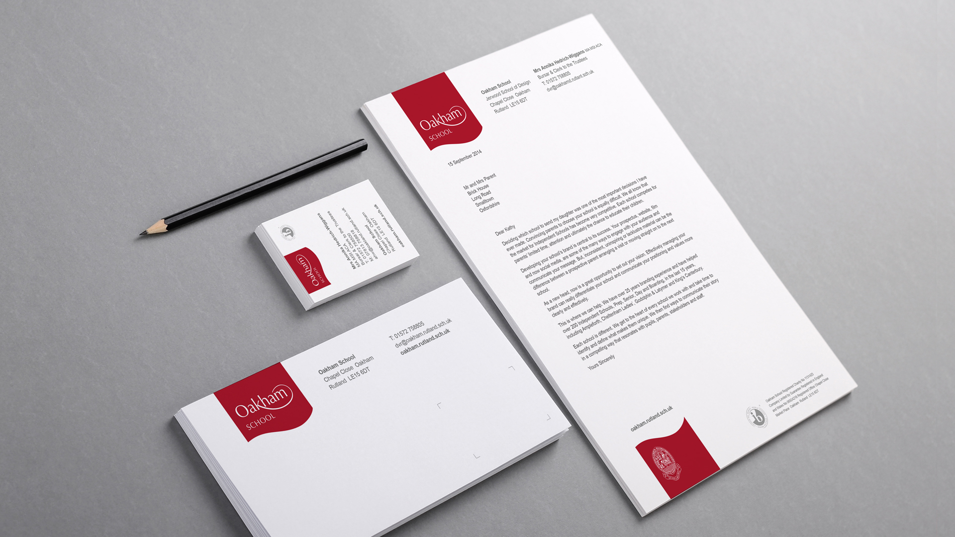
The Oakham logotype you designed five years ago has become part of the fabric of the school. However there has been some confusion arising as a result of the loss of the word ‘school’ and the relationship of the school badge. Also, whilst the reversed out approach has been well received a consistent colour, perhaps relating to our heritage, would be welcome. Could you investigate and make recommendations. We also need a comprehensive set of guidelines
Direction
The Oakham school brand refresh was significantly strengthened by taking an evolutionary approach. The basic logotype was retained but the addition of the word school had to be carefully considered and balanced alongside the logotype itself. A unifying background was added, inspired by the red already in use on the school sports kit. A confident colour giving the brand great impact and easing the process of applying the identity across a variety of media.