New brand, new prospectus
"We are completely full for next year with waiting lists in a number of years, and pretty much the same picture the year after - so the work we did has paid off and confidence is at an all time high!"
Brief
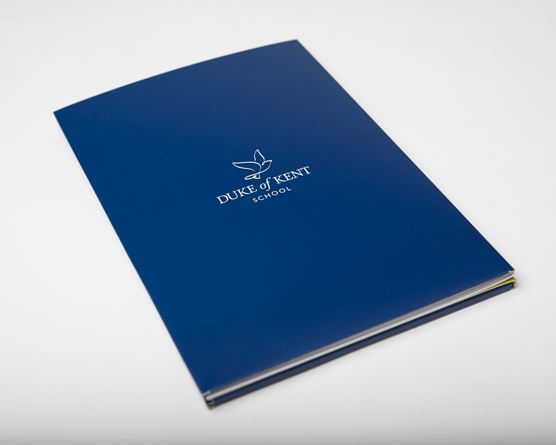
From our Prep School foundation we are three years into being a through to 16 school. Whilst we don’t want to lose our unique small, community feel and our individuality, we must ensure that our brand reflects that evolution and projects the right message. We need a new brand across everything – and a new prospectus.
Direction
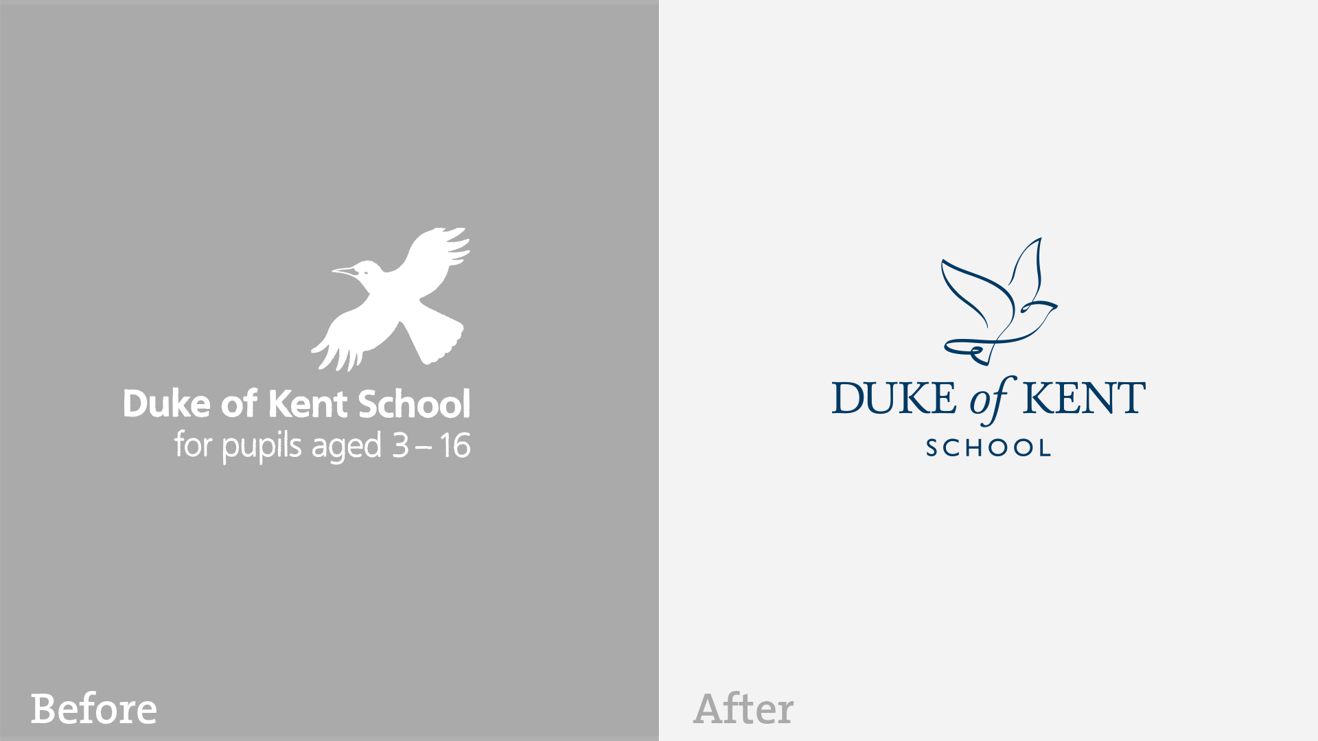
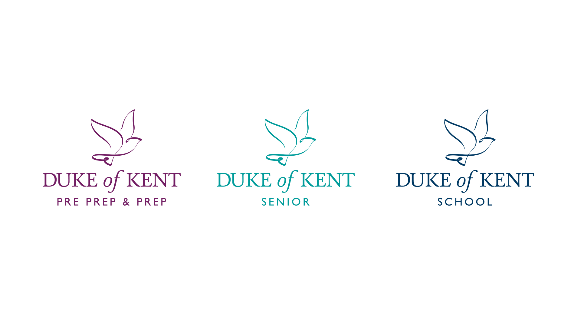
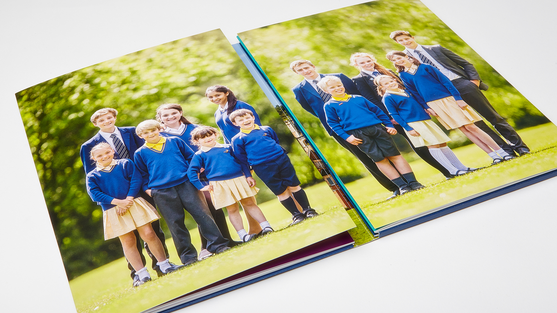
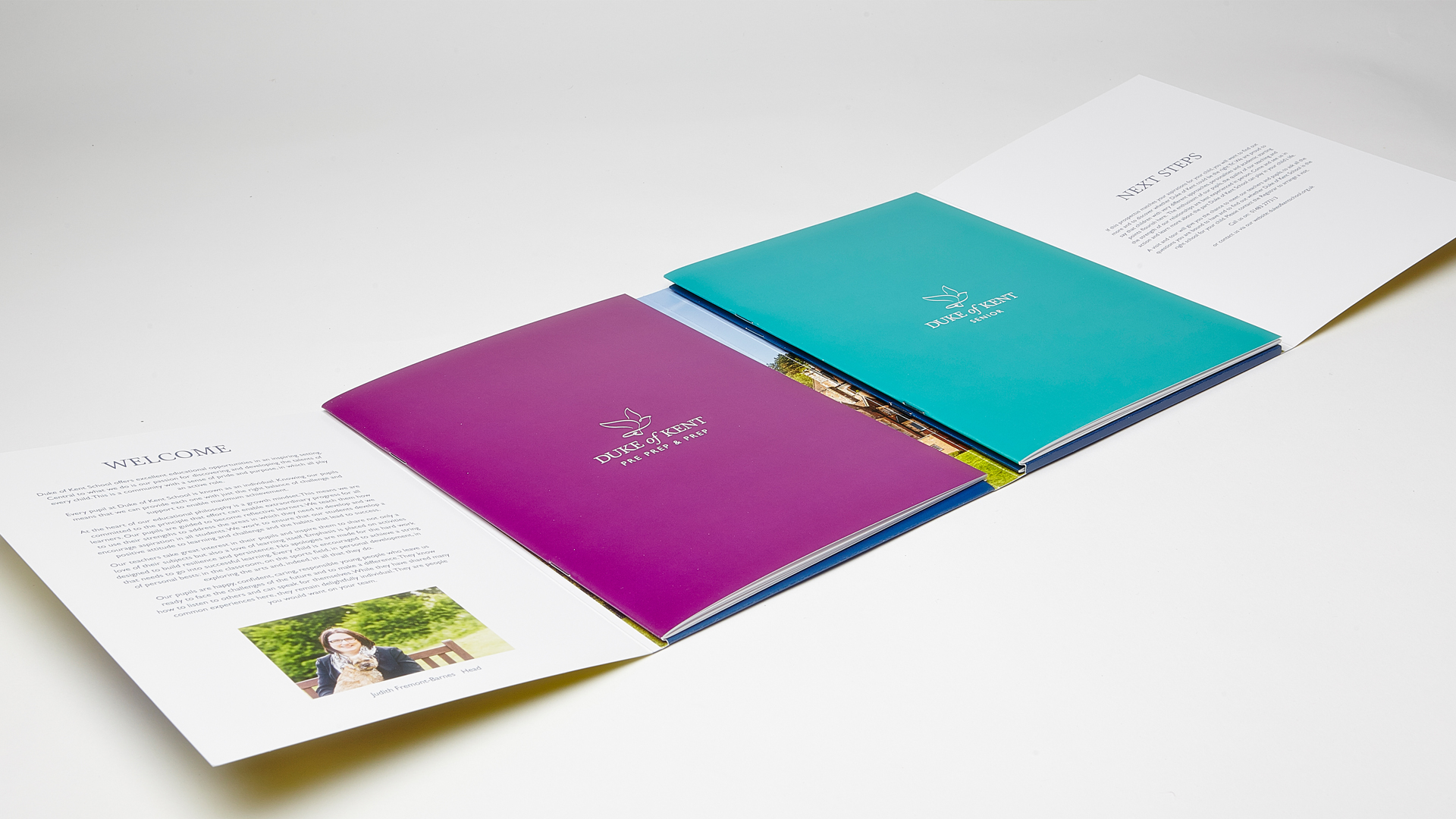
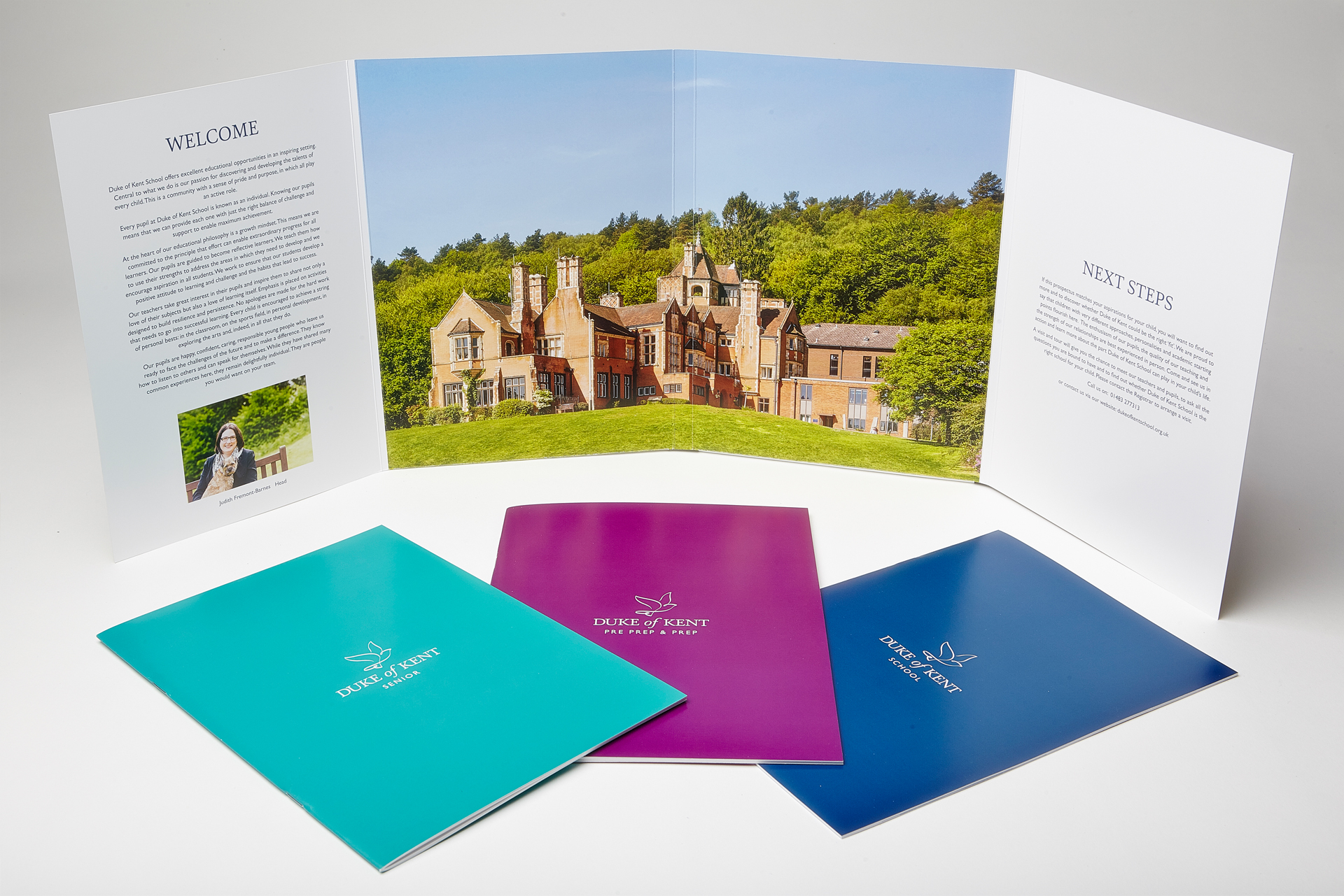
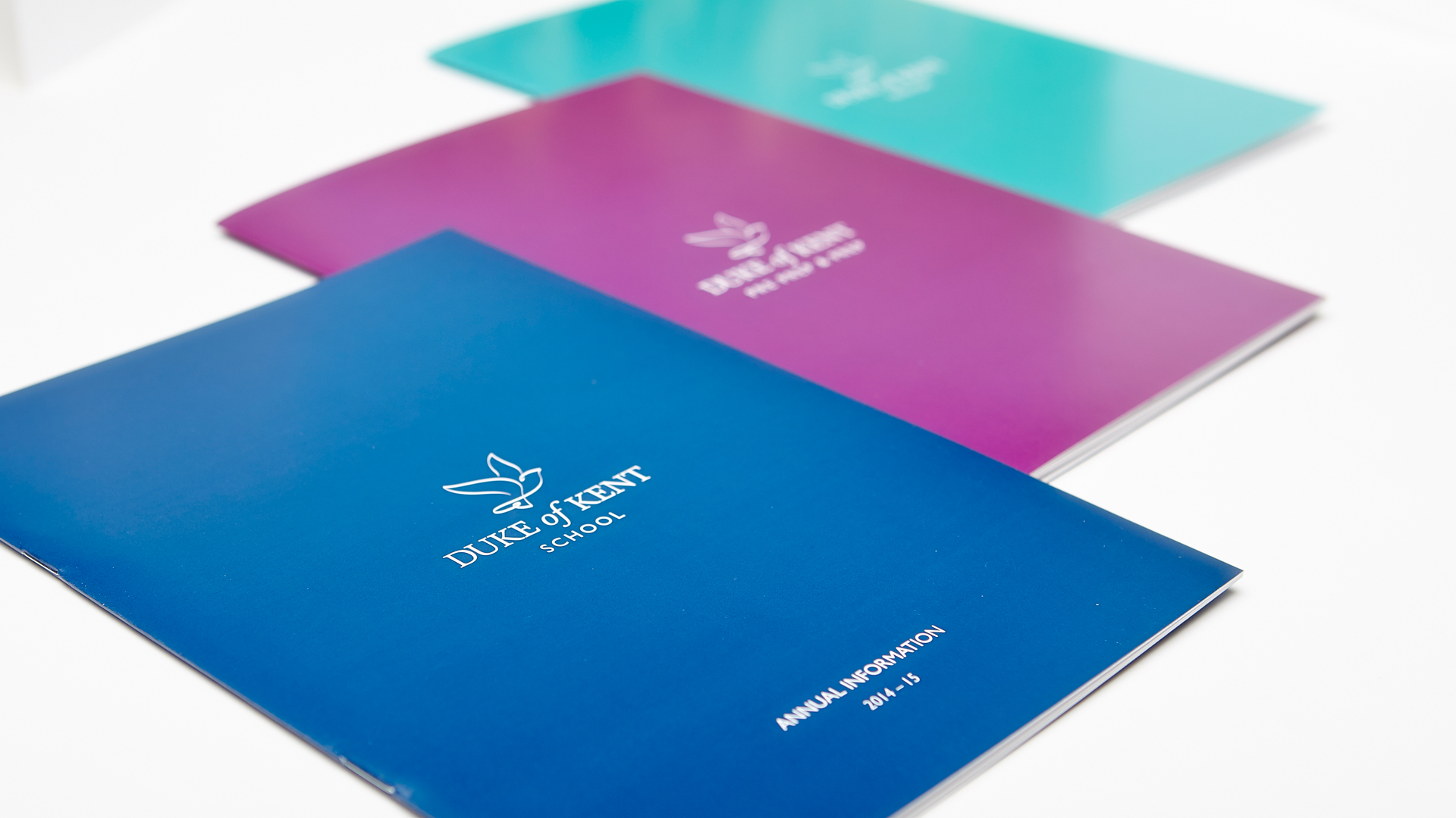
The new brand identity and the new prospectus design was developed through an evolutionary process that came from within the school. The shareholders were closely involved in the focus groups and research into the school’s heritage. The solution was to develop a new type style and modernise the existing bird silhouette by creating a calligraphic interpretation that added movement and finesse to the mark. Whether you’re looking for a brand refresh, great fund raising ideas, original prospectus design or school website design, please get in touch.
