New brand for global payments business
“This really is the best brand design.The stand is fantastic and I have just seen the business cards and brochures. Can’t say anything other than they are stunning! Thank you”
Brief
Following significant year on year growth and a re focus on the end user, Secure Retail needed to ensure that the company’s brand identity accurately reflected the business. The old look and style, no longer communicated what the business now represents or its future plans
Kilvington was commissioned to undertake a complete brand audit, helping provide clarity and focus of message and tone of voice. A clear positioning and core brand values were developed, accurately communicating the ethos, activities and unique benefits of the business.
Direction
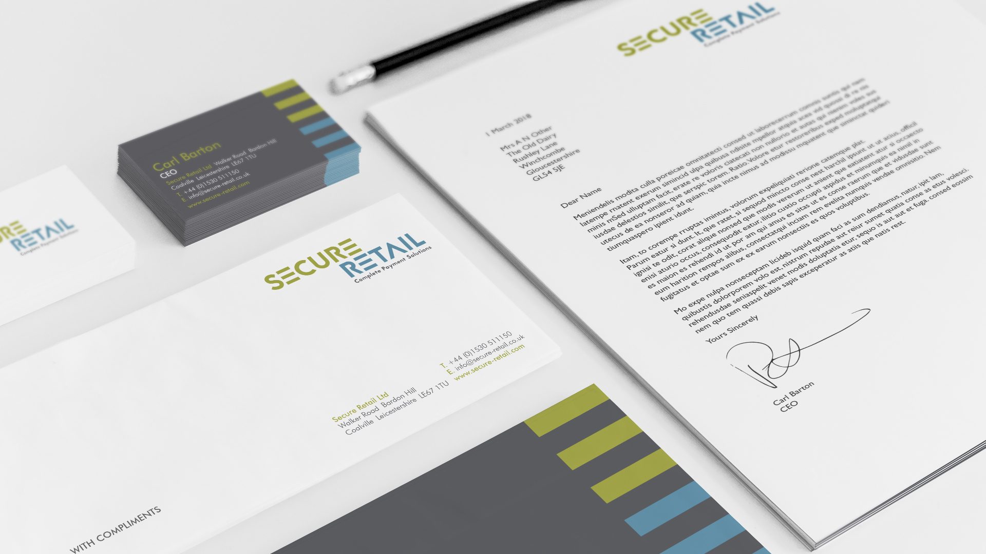
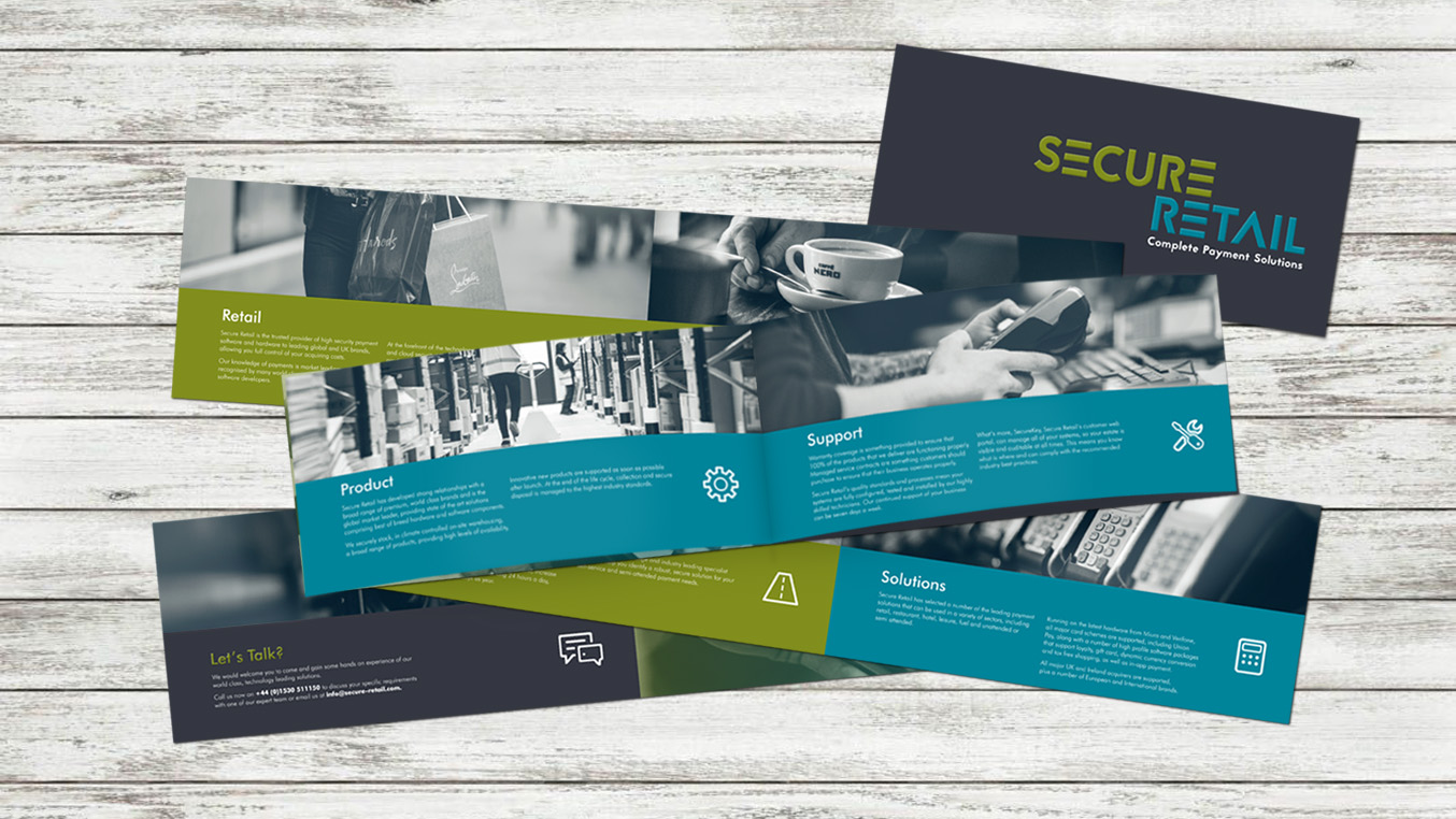
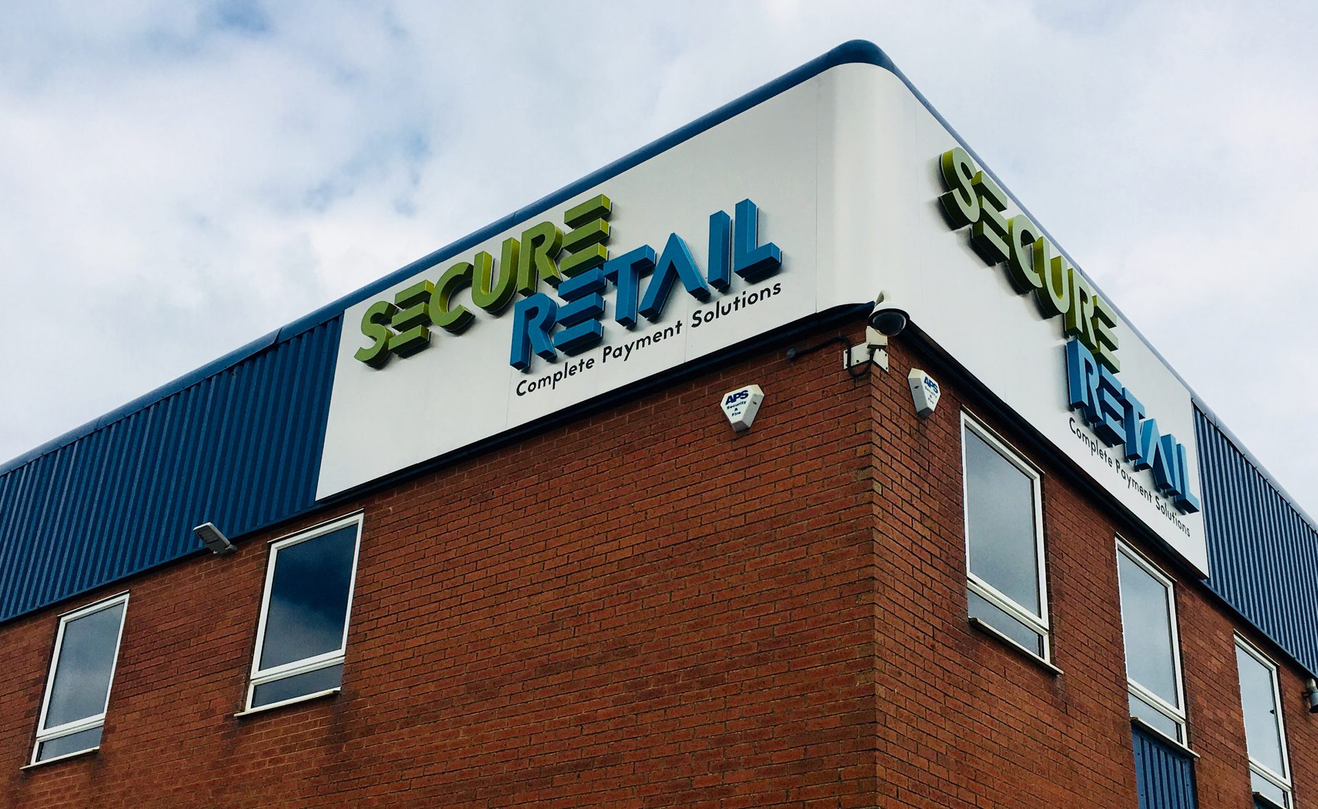
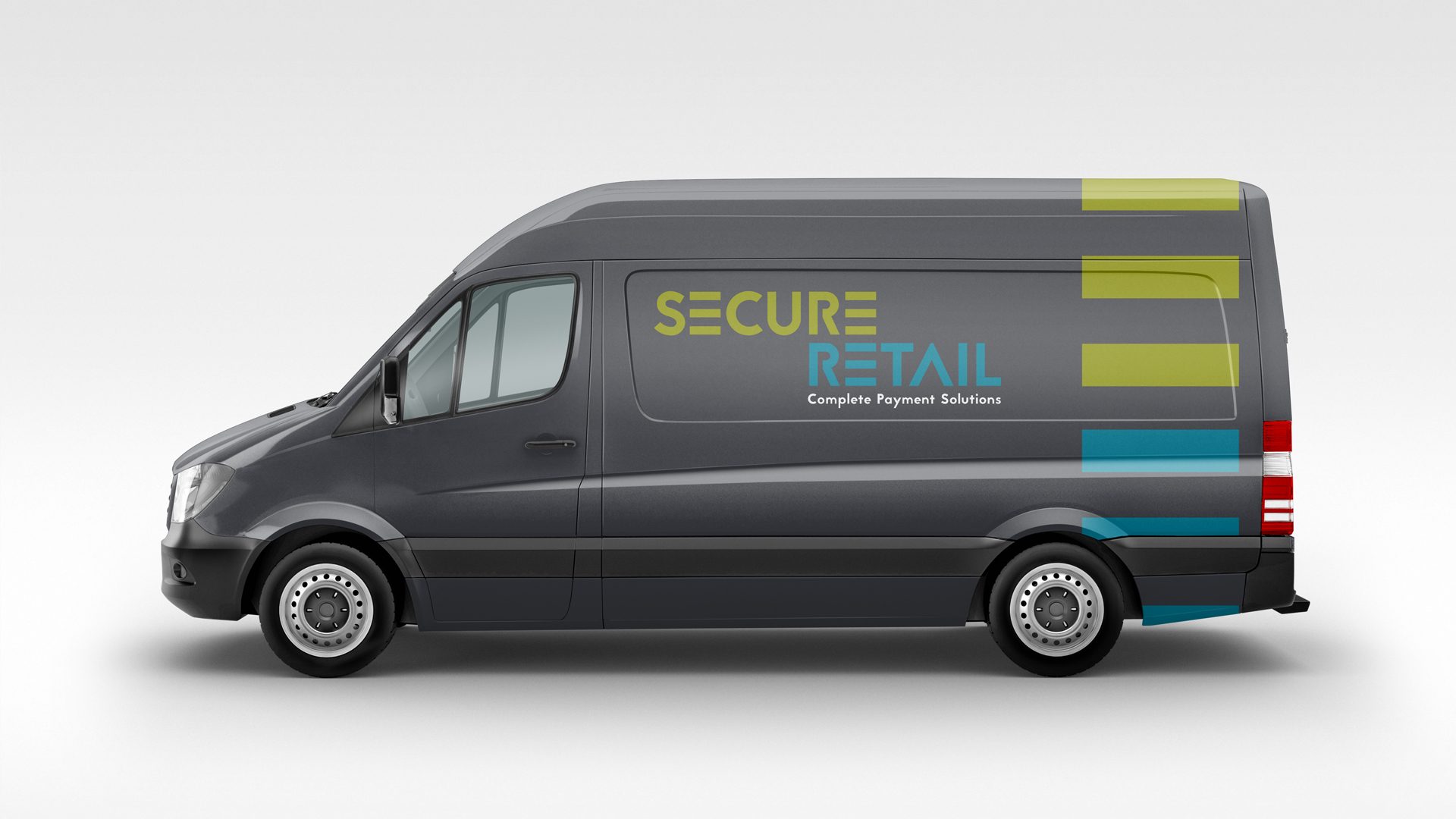
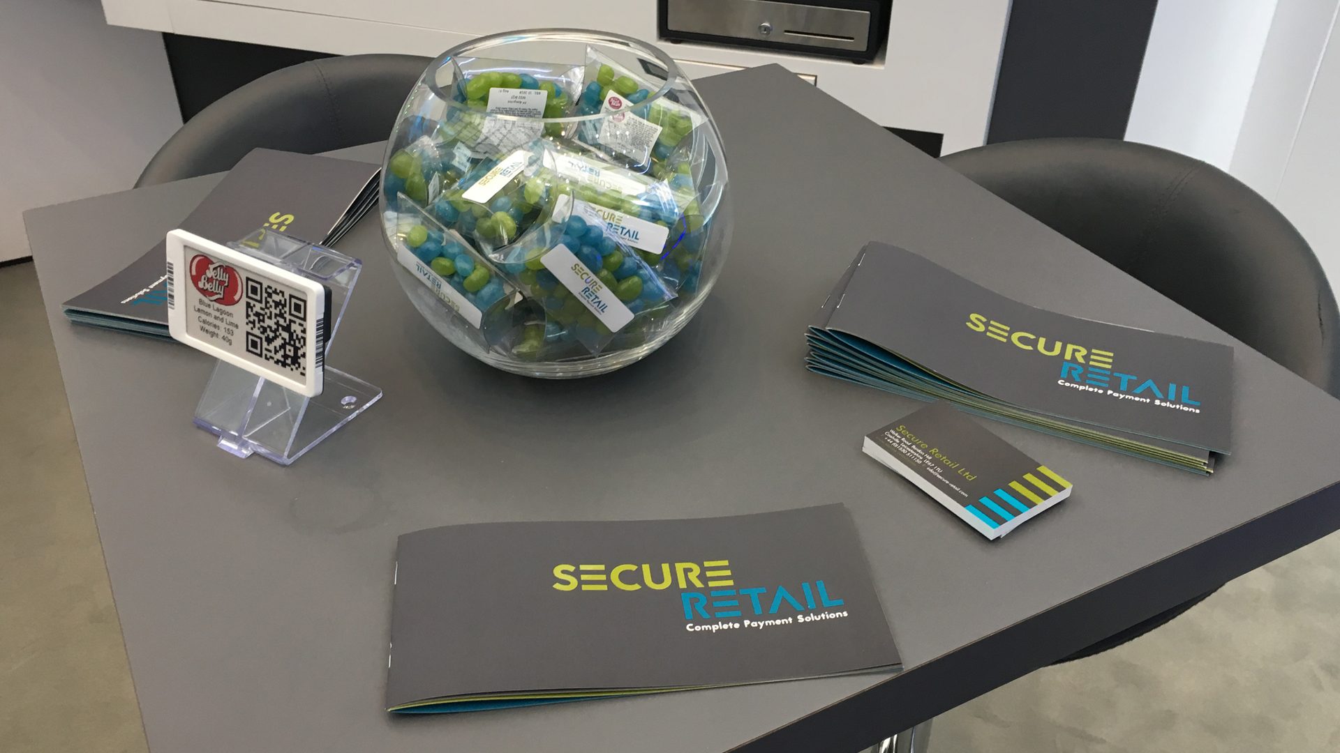
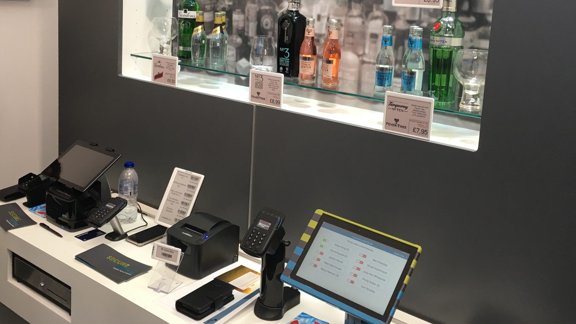
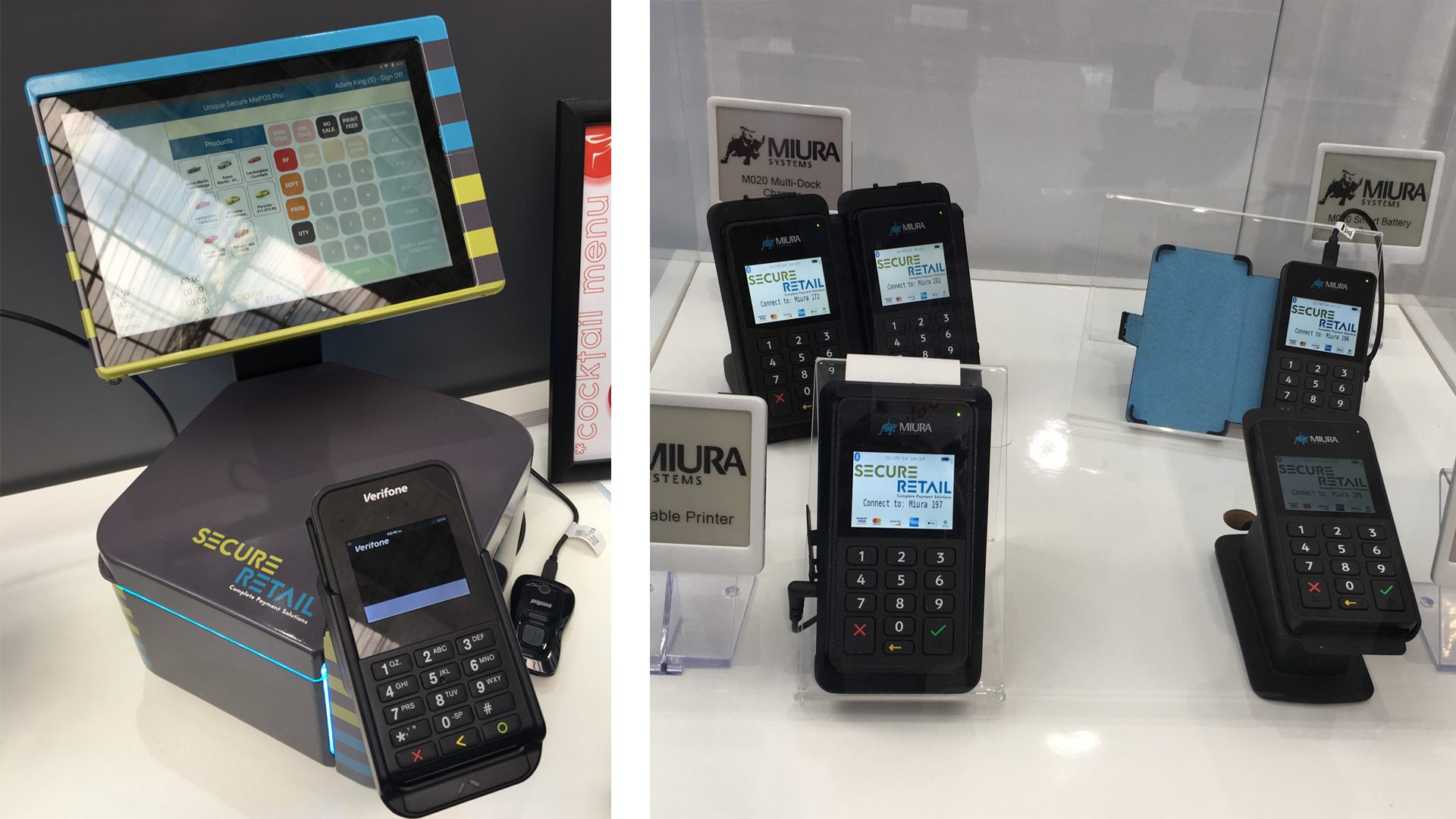
The audit informed the creative interpretation of a new brand identity for Secure Retail, embracing logotype, secondary branding elements, colours, fonts, icons and images.
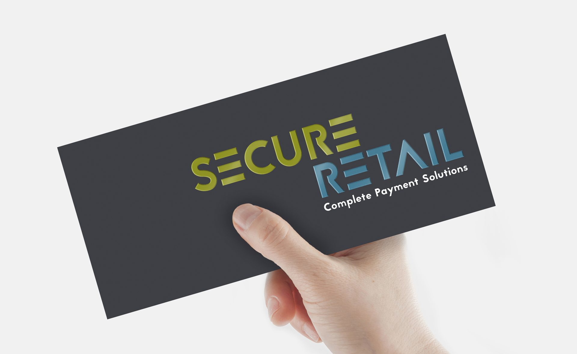
The fundamental premise of matching public and private access, reflected in the relationship of two capital Es in the company name, provided the direction for the logotype. Bold colours helped emphasise a retail feel.
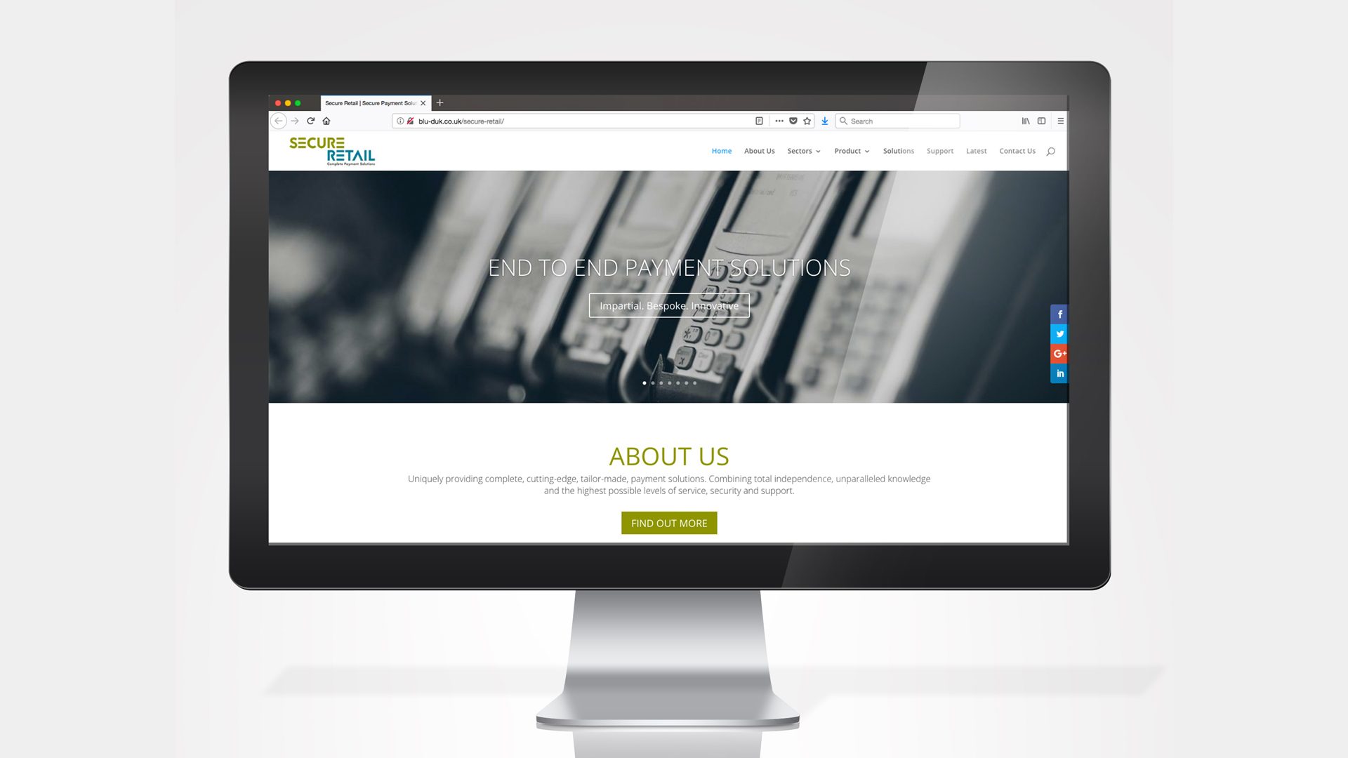
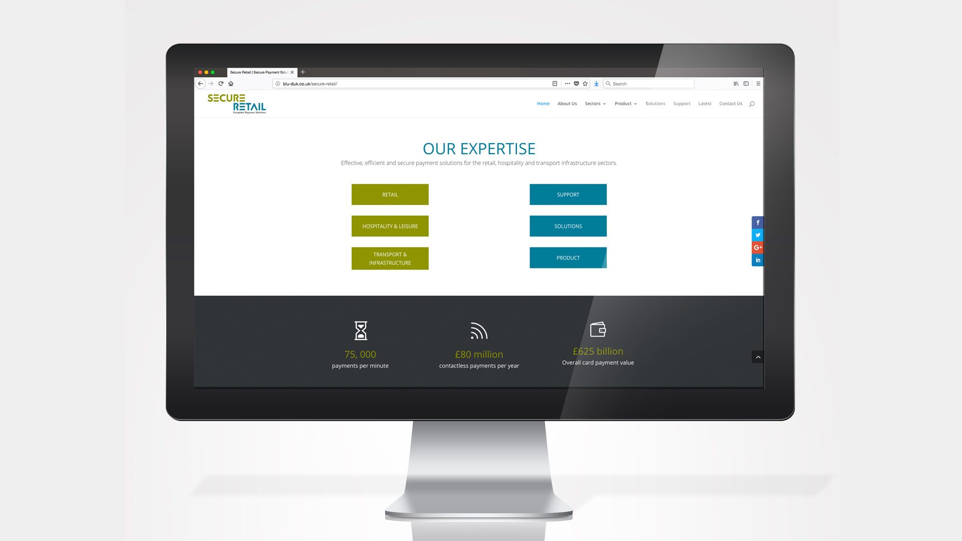
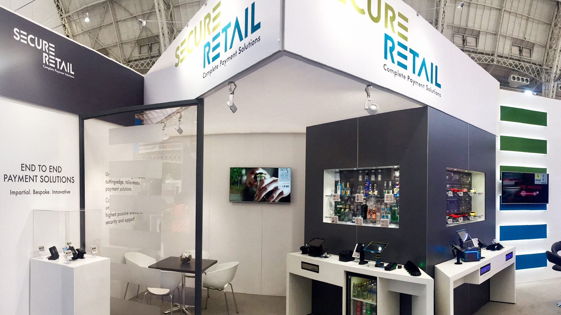
A brand new website coincided with RBTE at Olympia, where Secure Retail launched its new brand identity with a new stand design and literature.
This fresh, new brand identity accurately reflects the direction of the company for the foreseeable future.
Visit the new website here