New brand identity 10 years on
“Our new brand provides an exciting platform to take us forward and the prospectus looks excellent. I think it will give prospective parents a really positive introduction to Richard Pate.”
Brief
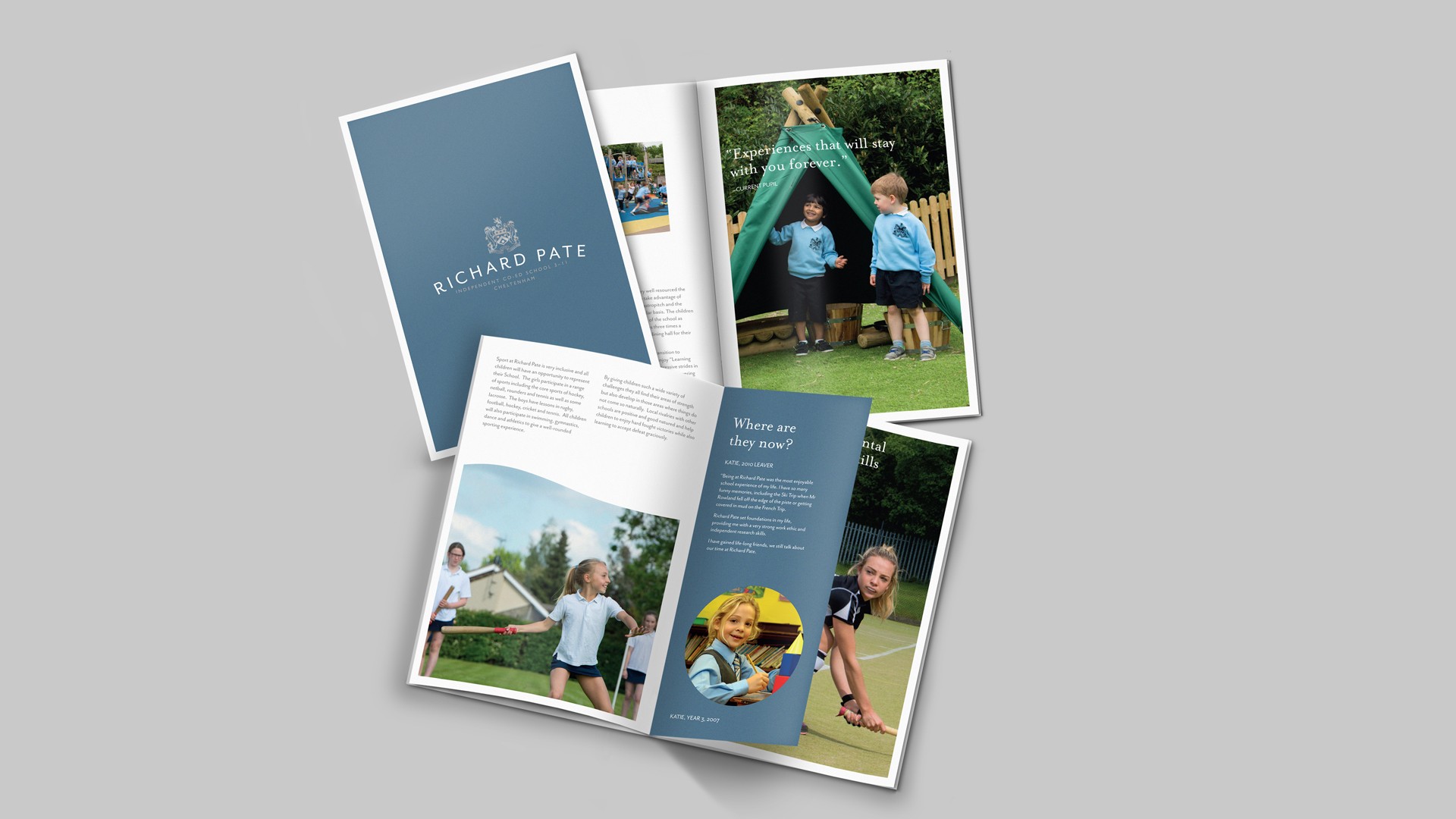
The very successful prospectus created by Kilvington in 2007 had reached the end of its life, mainly because many of the pupils featured were now at University. Now was the time to update and also an opportunity to refresh the school’s brand identity, not part of the original commission. The new brand needed to be evolutionary and reflective of how much the school has developed, both in terms of its positioning and values and also its physical attributes and resource.
Direction
The strengths and benefits of Richard Pate were clearly communicated by the pupils themselves in the original prospectus. The new prospectus provided a perfect opportunity to revisit some of those pupils and from their perspective as Sixth Formers and University students, reflect on what a great foundation provided for them.
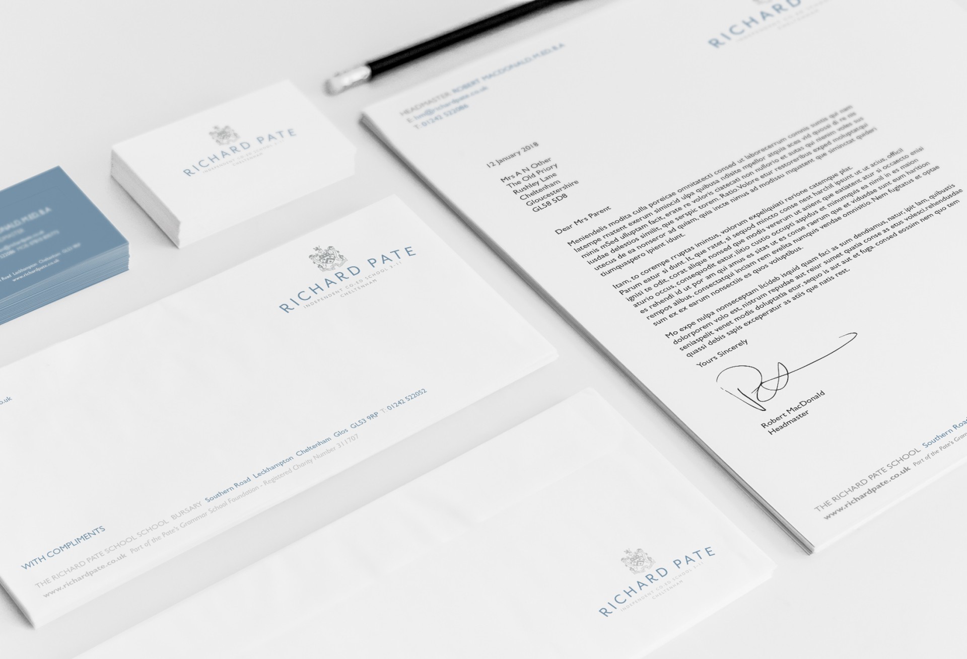
The Foundation crest, and typography reflective of the school’s new build architecture, combined to create a new logotype, which with an evolutionary colour palette, projected a fresh, clean image with heritage and gravitas. This has been applied to stationery, signing, minibus and website.