Brand styling is the sum of its parts
“Quite remarkable really how well we’ve stayed on track with such a big project – and that is down to your major hard work and brilliance so I’m incredibly grateful.”
Brief
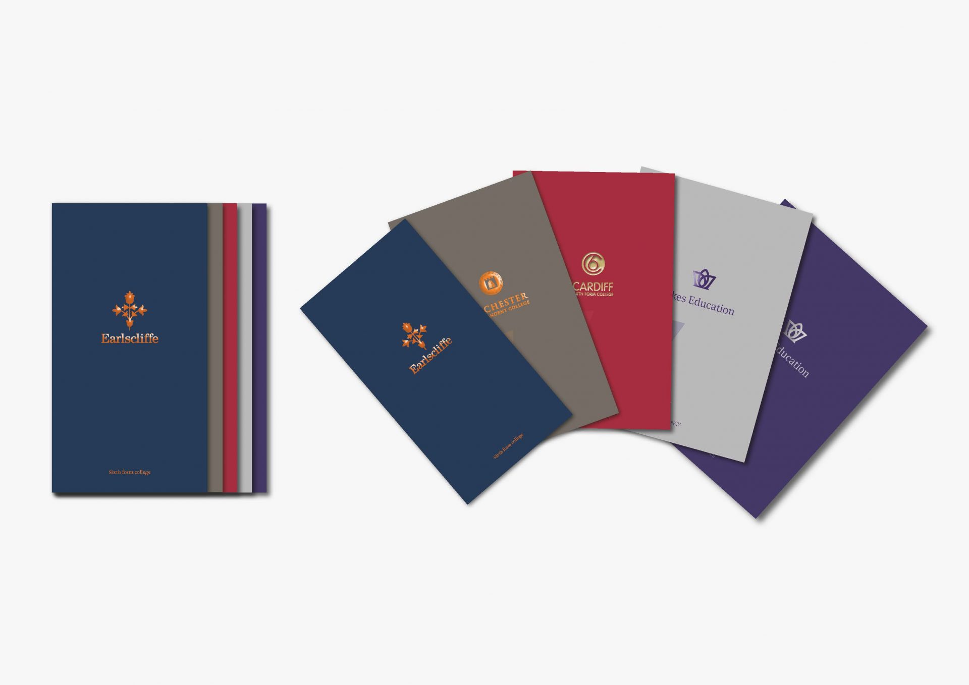
Dukes Education comprises a number of schools and has developed rapidly over the last four years. This needed to be communicated both as the single Dukes Group as an entity and the individual constituent colleges, through developing an integrated pack of brochures, absorbing existing materials attractively, and producing new ones to complement, enabling the portfolio to be represented in an effective way.
Direction
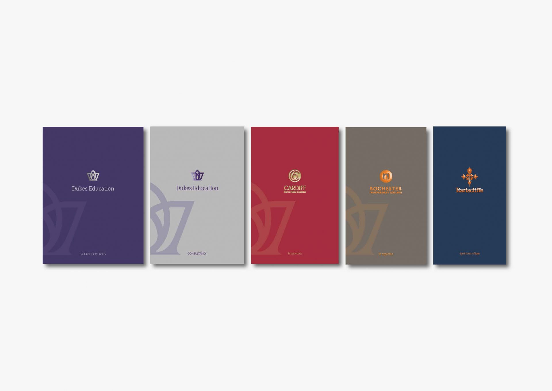
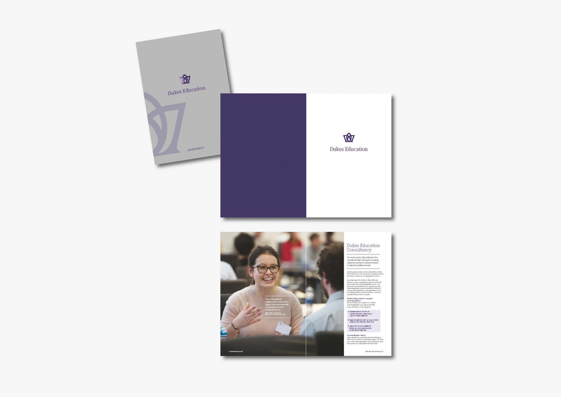
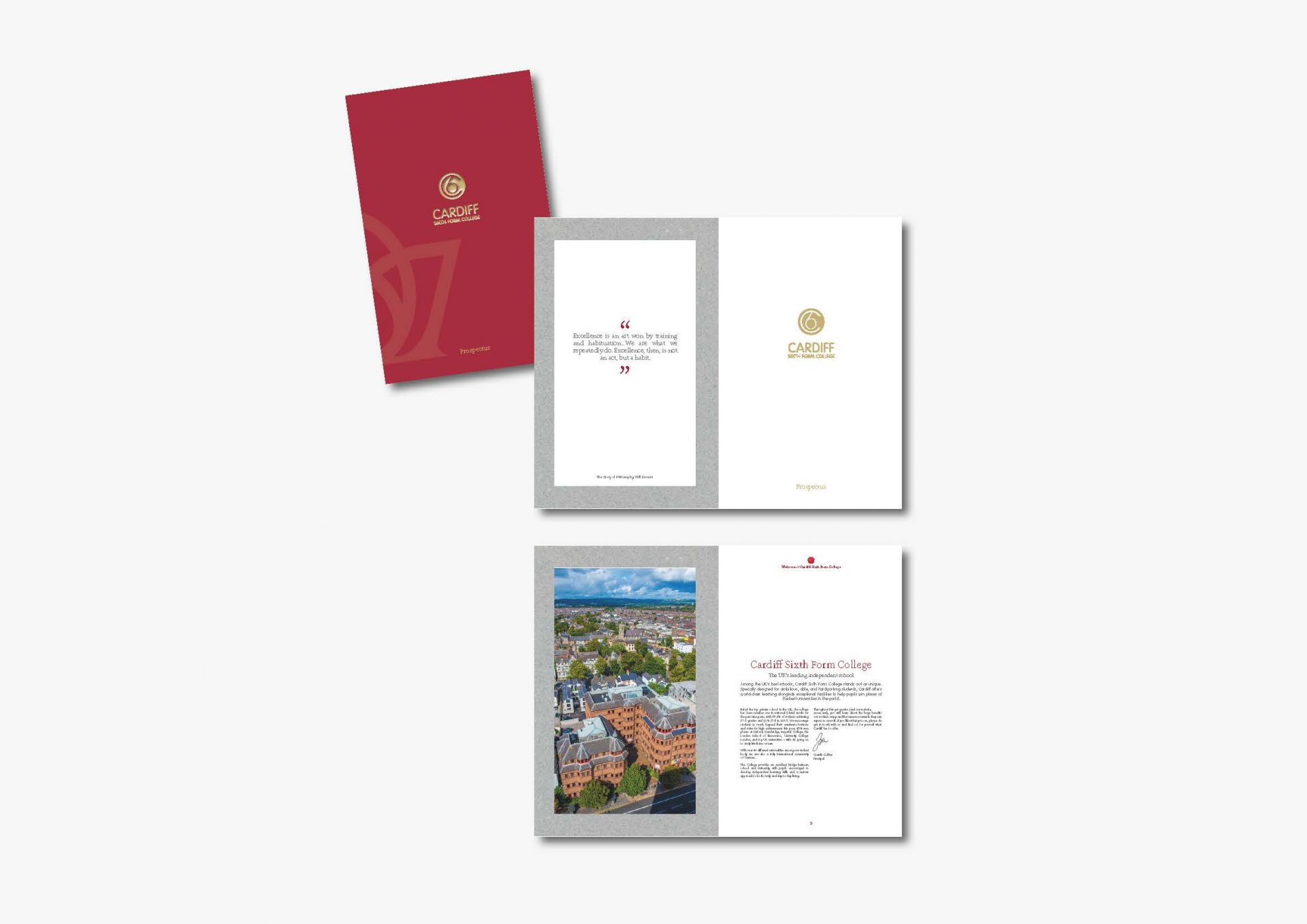
How to create a fully integrated look and feel without re branding the group or the individual schools? And to integrate an existing prospectus! Common elements were identified and unified. A Dukes wrap around folder communicating core positions and values contains the five prospectuses, staggered in size to feature and index. Uncoated stocks and foil blocking reflected each individual brand identity whilst creating a considered and stylish consistent look and feel.