Strong brand image speaks a thousand words
“The whole creative process was an enjoyable experience from start to finish.”
Brief
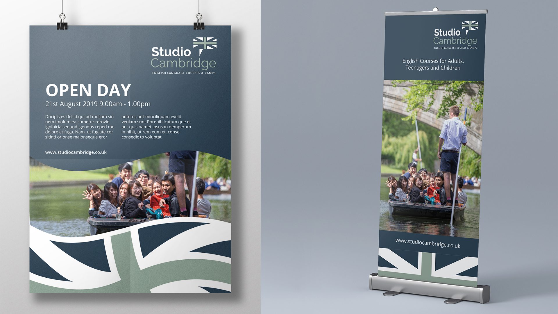
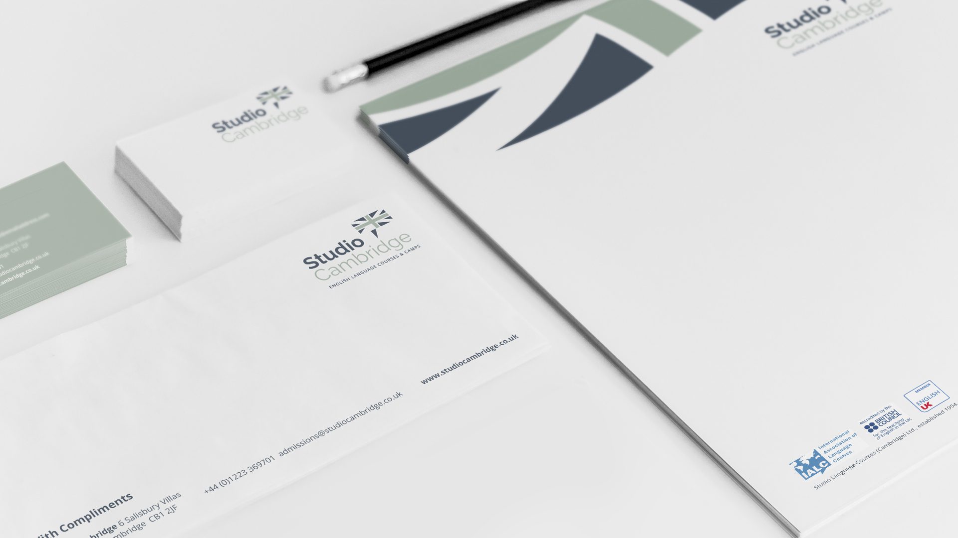
Studio Cambridge is an established, leading, international expert in EFL, providing short term, individual, English language courses and Summer Camps for students aged 8 to adult, based in the University City of Cambridge. Studio provides a diverse range of quality courses, combining an accessible, flexible approach with efficiency, reliability and value. Following acquisition, (add comma) the school needed to present a fresh new look, more relevant to the future direction of the business, whilst still underpinning (one word) the long established ethos and values, recognised and respected in the sector.
Direction
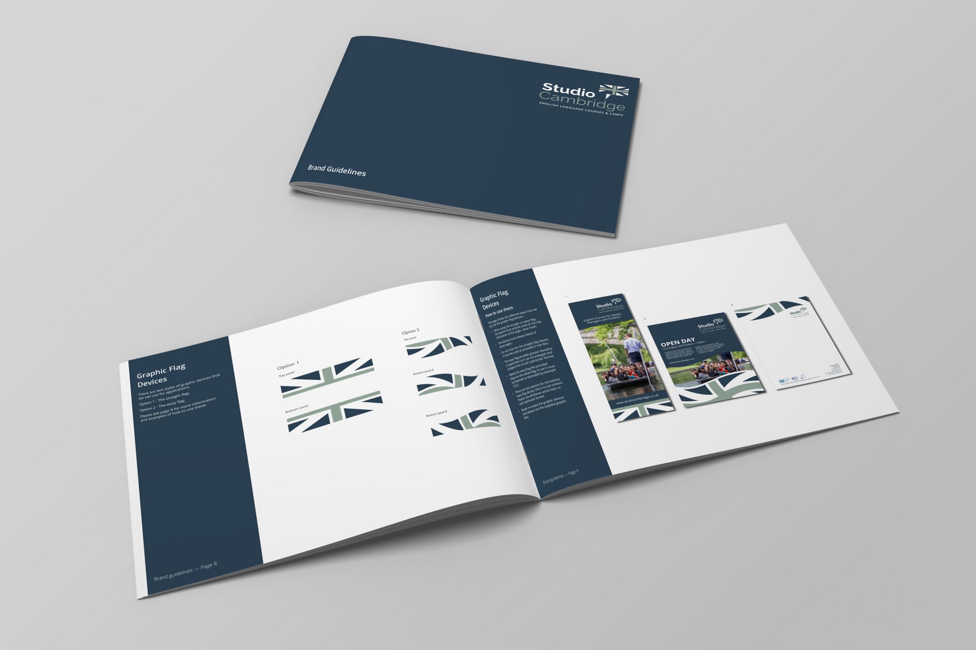
With an international audience primarily comprising agents and schools, the British location and quality values and perception, (add comma) combined with English as a language, (add comma) were paramount. The use of a simplified graphic interpretation of the Union Flag in new brand colours is an immediate positioner in a crowded market. The simple twist of turning one inverted triangle though ninety degrees to create a speech mark/bubble is a witty way of adding personality and character, very much part of the Studio Cambridge culture.
To view the new website click here.
“Building a new look for for us after 65 years was never going to be an easy task, but Kilvington’s hands-on, getting-to-know-you approach meant they quickly understood exactly what we were looking for. With no fuss they successfully created a simple but effective new brand, with a whole new theme for us to work with. The whole creative process was an enjoyable experience from start to finish. Kilvington have done a terrific job and we are very grateful for all the hard work, support and understanding they have provided.”
– Richard Mountford, Managing Director