Dragon breathes life into top brand
"All our materials and concepts were delivered on time and to budget. I would have no hesitation in recommending Kilvington for anyone demanding a creative approach."
Brief
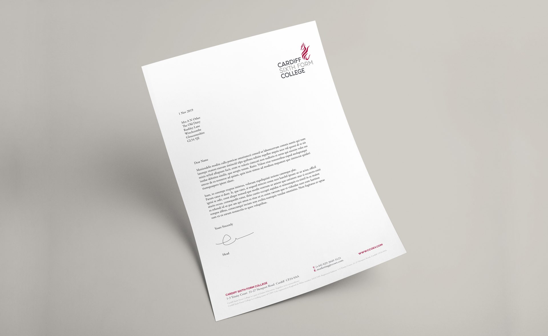
Enjoying exceptional academic success, Cardiff Sixth Form College regularly tops A Level league tables. However, whilst updated and improved two years ago, the logotype projected an old fashioned, slightly down market image. As such the visual brand identity did not accurately reflect the status and success of the College, lacking a quality, proud, professional, reassuring feel. Whilst the jewel in the crown, the brand did not fit comfortably in the Dukes Education portfolio, lacking coherence, impact and a distinctive, compelling quality.
Direction
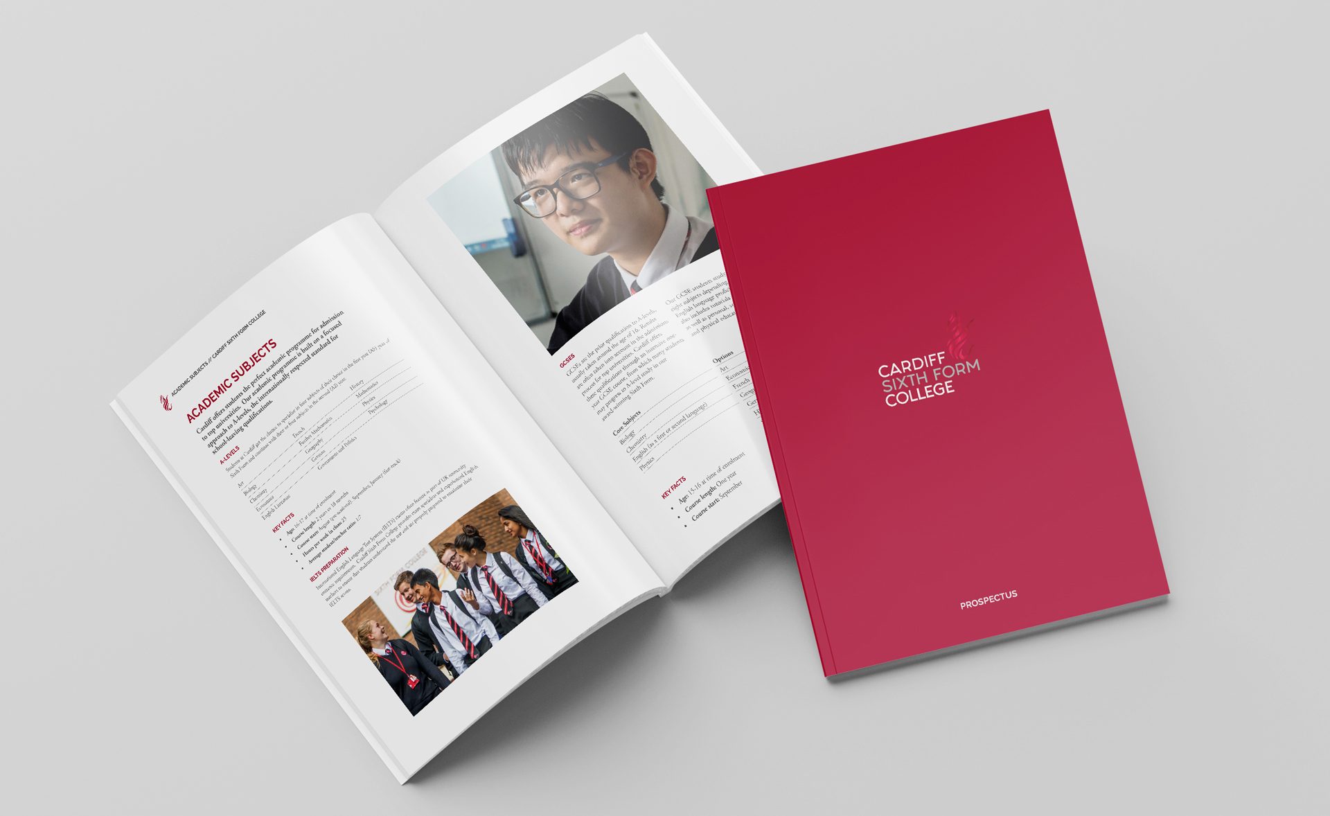
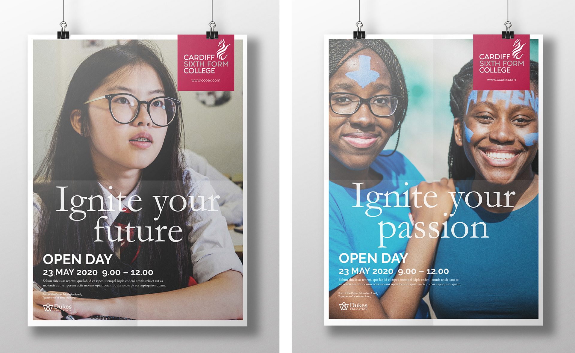
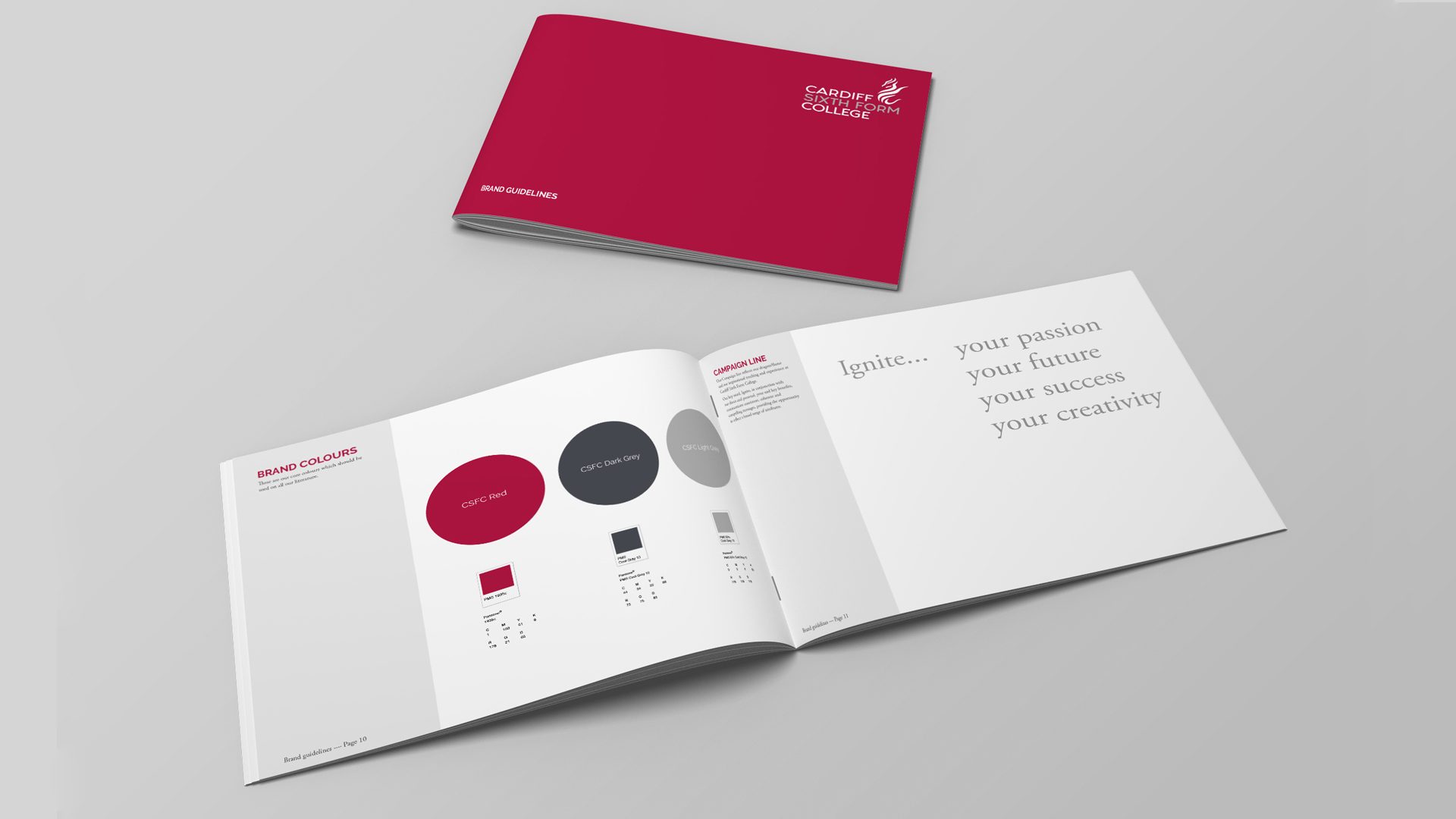
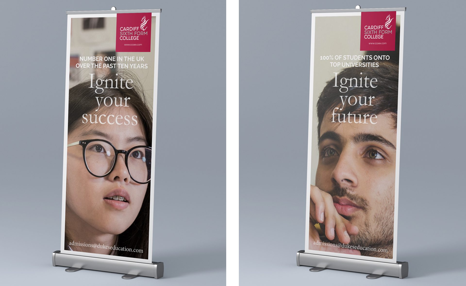
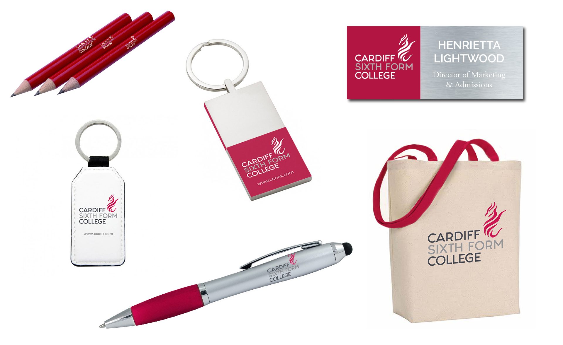
It was essential to generate increased awareness of CSFC and its values amongst its target markets and to create a greater synergy with the Dukes Brand. The nomenclature was the brands major strength and a proud Welsh heritage had to be emphasised. Academic rigour and success is what the College truly stands for. A flame like representation of the iconic Welsh red dragon also suggests igniting a burning love of learning. Combined with strong, confident typography, this is the lynch pin, presenting a coherent, compelling and consistent brand identity across all aspects of College, with confidence and pride.
“Paul and his team have re-branded Cardiff Sixth Form College so that the College is now modern and relevant. We wanted a clean and contemporary image that reflected our values yet also hinted at the College’s Welsh roots and linked to our global audience. Paul and Emma were creative, organised and understood precisely what we required. All our materials and concepts were delivered on time and to budget. I would have no hesitation in recommending Kilvington for anyone demanding a creative approach.”
– Henrietta Lightwood, Group Marketing and Admissions Director
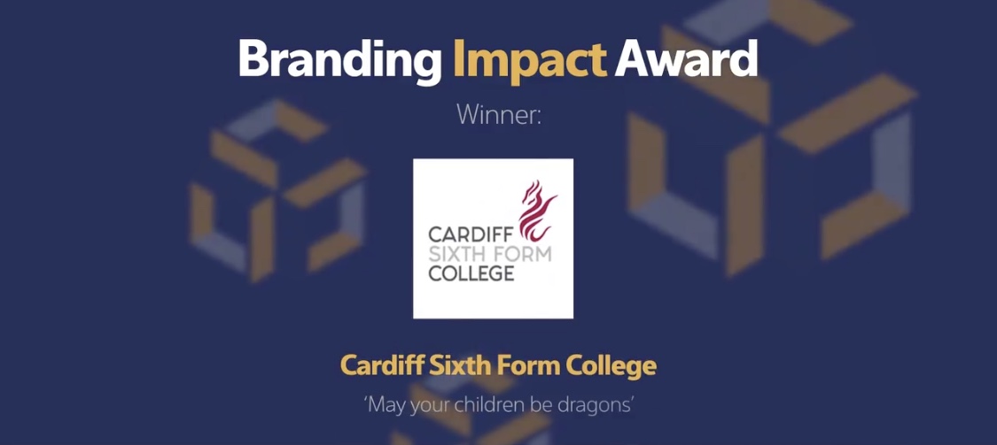
Winner of the AMCIS Branding Impact Award 2020!