Cutting edge brand for Sheffield Girls'
"We could not be any more delighted with the outcome. Paul challenged us to think much bigger than we have before and Emma’s clean and eye-catching design style has resulted in a new brand identity which draws from our heritage but firmly reflects our forward thinking and innovative school."
Brief
Sheffield High School for Girls, a GDST flagship school, has enjoyed considerable success over a number of years, despite little marketing and a brand image best described as tired. With a new ‘Old Girl’ in post to clarify and focus marketing activity, a carefully considered and cost effective re brand was required. This was seen as a daunting task, needing a safe pair of hands to win hearts and minds, creatively interpreting and delivering on time and within budget.
Direction
Focus groups involving the whole school community confirmed a no-nonsense, pragmatic, down to earth ethos and approach to a quality education of girls for the modern world. Also evident was a huge sense of pride for the heritage and traditions of the school and Sheffield itself.
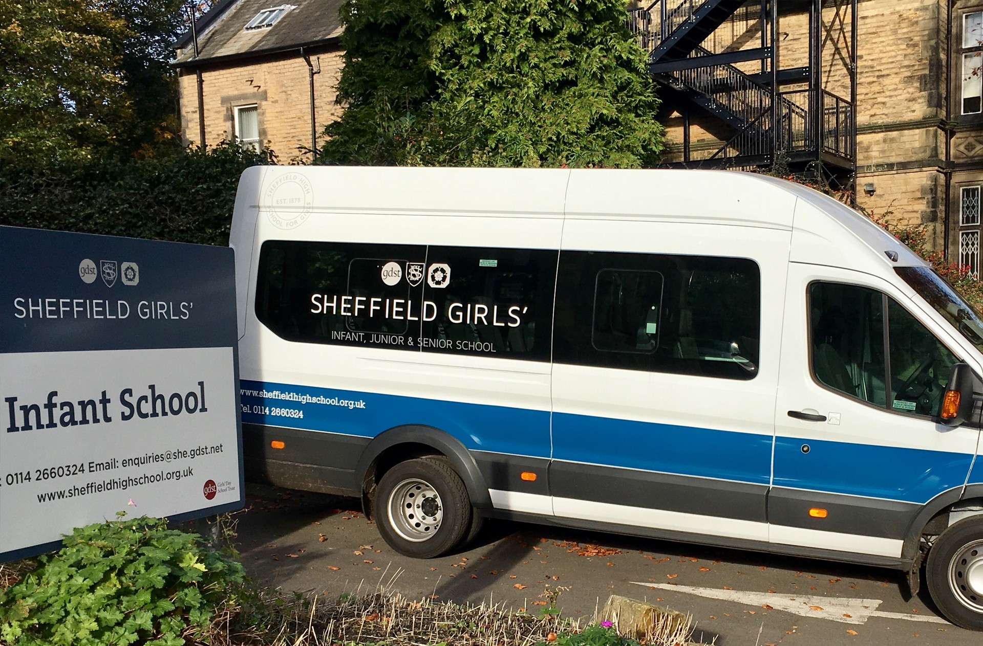
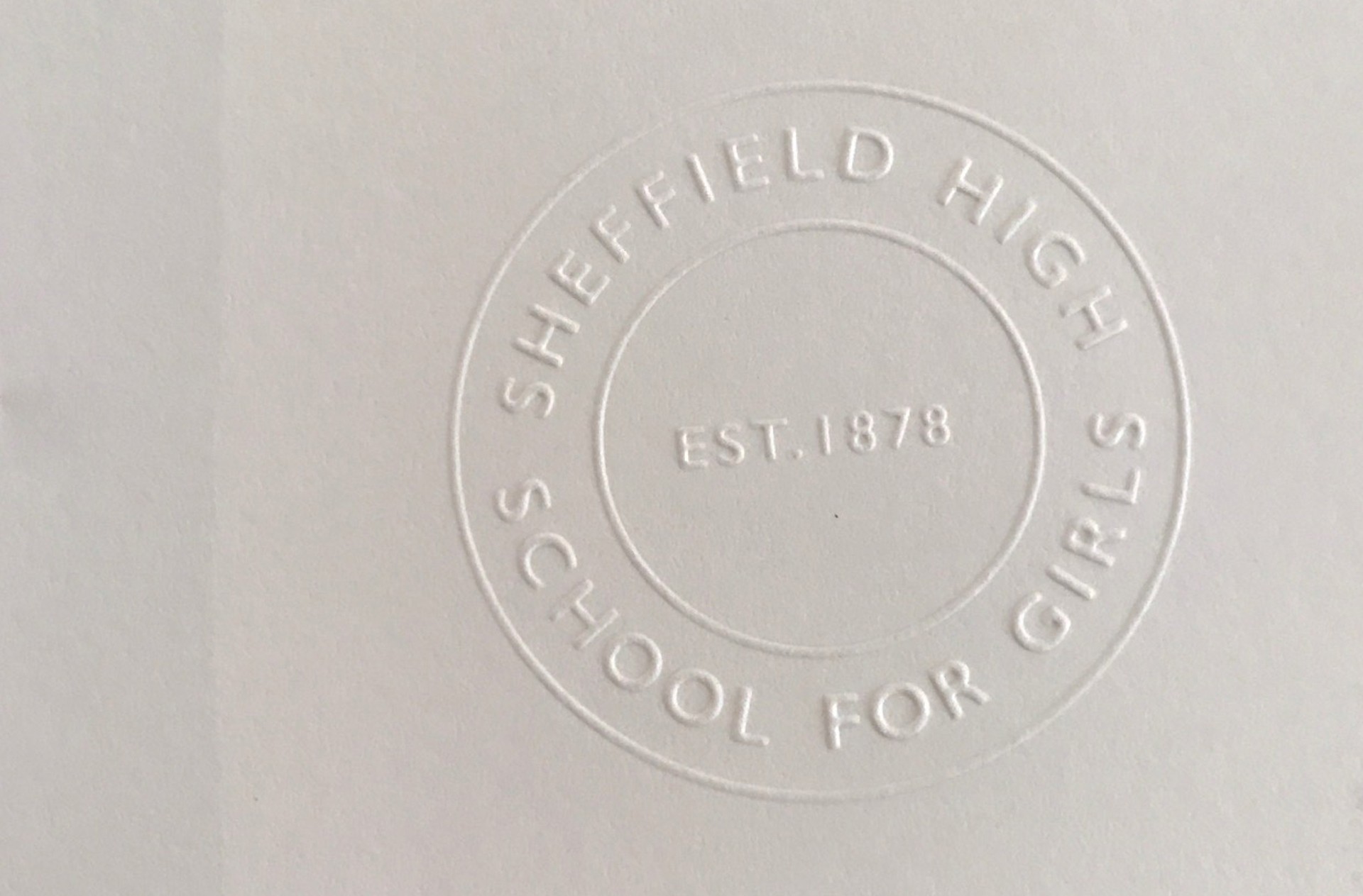
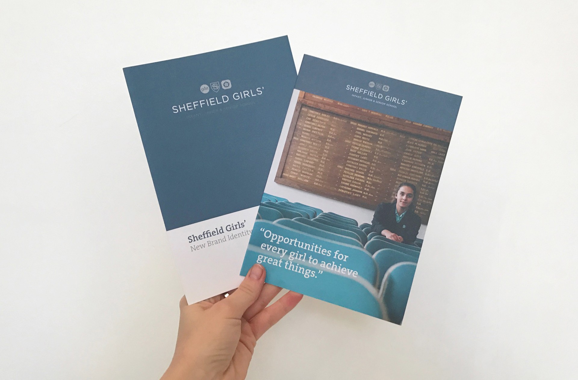
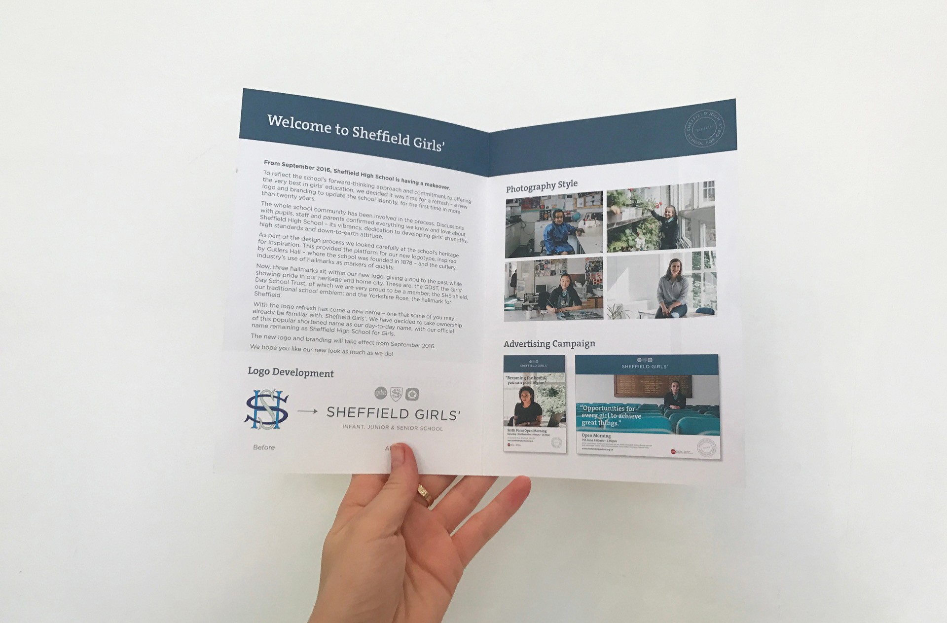
It soon became apparent that there were many parallels with the quality, craftsmanship and sheer polish of Sheffield’s stainless steel and cutlery making heritage. A hallmark design, embracing the school’s parentage (the GDST logo), positioning (Yorkshire rose), and past (school crest), created a relevant, stylish and contemporary marque, immediately communicating key messages.
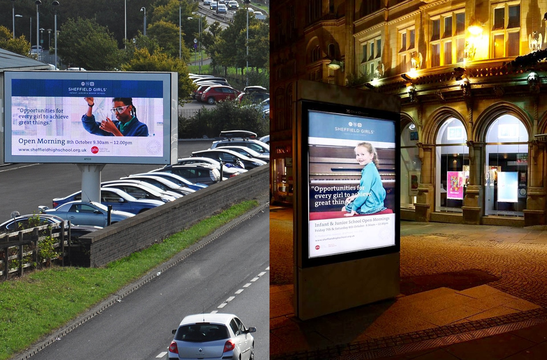
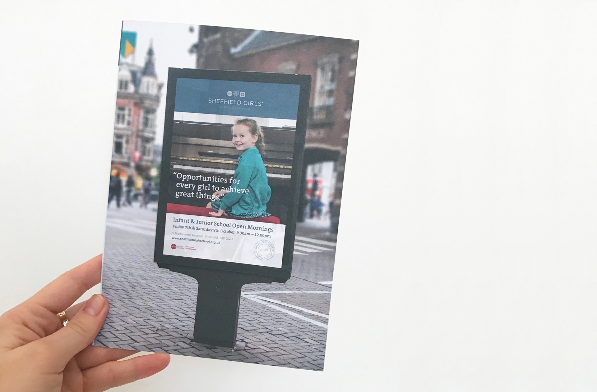
Combined with a sharper, more colloquial name, a new colour palette and font suite, roundel stamp and strong messages from the girls themselves, a fresh, distinctive and consistent new look for all marketing and communications is being implemented, creating quite an impact.
“Sheffield High School embarked on a branding exercise earlier this year. The first time since the school had ever formally looked at how it presented itself. Although it was widely acknowledged it was time for a rebrand, along with that came a lot of nervousness around the process and change.
From our first meeting, Kilvington’s expertise in branding was clear. Paul clearly understood our current position and was able to reassure internal stakeholders about how the process would work, combined with his wealth of experience in the sector, we knew we were in safe hands.
It was a pleasure to work with Paul and Emma throughout. Their informal but rigorous approach to the branding process ensured that we moved smoothly through each stage, from research to launching the brand.
We could not be any more delighted with the outcome. Paul challenged us to think much bigger than we have before and Emma’s clean and eye-catching design style has resulted in a new brand identity which draws from our heritage but firmly reflects our forward thinking and innovative school.
Refreshing the brand has brought with it a new found pride in our school. The implementation could not have gone any smoother and we never fail to be delighted with how much fresher and smart our marketing and communication materials are looking.”
Amy Bouchier, Head of Marketing, PR and Communications